DAVID PHILLIPS: LAB 8
The station fire devastated a fairly large area. It burned more than 90,000 acres. Two firefighters died and eighteen homes were burned. This fire completely deforested a huge area of wilderness. Deforestation in mountainous areas heightens the risk of mudslides.
Southern California is an area that experiences a high amount of earthquakes. Deforestation creates an increased risk of landslides. Earthquakes can trigger landslides in unstable landscapes. Hospitals are inevitably located in areas that are not flat. The maps shown below will be used to determined whether or not hospitals are at risk.
Map 1 is a 3 dimensional render of the area in question. A large portion of the area burned was contained in the 3D model. As can be seen, the burn area and surrounding regions are quite mountainous. Because it was deforested by the Station Fire, it is clear that this region had a higher risk of mudslide after the fire. In the map, the purple areas are the lowest, while the green areas are the highest.
Map 2 is a slope analysis model. The outline is of the total burn area over all the days. This map shows us that the most mountainous areas were the ones that were burned. The green areas are the lowest points. The red areas are the highest points. The more multicolored an area is in this map, the steeper the incline, or, more rapid the change in elevation. The green dots are documented earthquakes. There is a great number concentrated in the area, especially just to the east of the burn zone.
Map 3 brings everything together. The crosses displayed are hospitals. There is one hospital that is very near to the south edge of the perimeter. The area has a high amount of earthquakes. However, the area around directly around the hospital has not been burned. Therefore, it is unlikely that the stability of the soil will have a chance of directly effecting this hospital. In conclusion, these maps lead one to the conclusion that the Station Fire did not result in an increased risk of landslide for hospitals in the area.
MAP 1

MAP 2
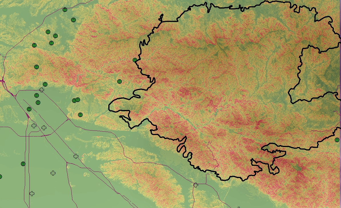 Break values for elevation raster by percent rise: 3 - 7 - 11 - 15 - 19 - 23 - 28 - 37 - 100 (Green to Red)
Works Cited:
31, August. "Station Fire Claims 18 Homes and Two Firefighters." Los Angeles Times. Los Angeles Times, 31 Aug. 2009. Web. 10 Dec. 2012.
Cannon, Sue. "Post-Wildfire Landslide Hazards." Post-Wildfire Landslide Hazards. USGS, 01 Aug. 2012. Web. 10 Dec. 2012.
Cannon, Sue. "Post-Wildfire Landslide Hazards." Post-Wildfire Landslide Hazards. USGS, 01 Aug. 2012. Web. 10 Dec. 2012.
Keeper, David K. "Landslides Caused by Earthquakes." Landslides Caused by Earthquakes. The Geological Society of America, 01 June 2012. Web. 10 Dec. 2012.
Trotter, Matthew. "Monument Fire Burn Areas Face High Probability of Mudslides, USGS Says." KNXV. Kronkite News, 1 Aug. 2011. Web. 10 Dec. 2012.-
USGS. "Landslide Hazard Information." - Causes, Pictures, Definition. United States Geography Society, Jan. 2012. Web. 10 Dec. 2012.
USGS. "Landslide Hazard Information." - Causes, Pictures, Definition. United States Geography Society, Jan. 2012. Web. 10 Dec. 2012.


